
Thanks for choosing Livemesh Addons for Elementor plugin. This help file aims to provide you with all the information you need to make the best use of this powerful plugin. The aim of the plugin to make the task of building a website effortless and pleasurable. Towards that end, we have built a number of elements most commonly used across most of the websites of small businesses, corporates, design agencies, freelancers, artists etc.
Do follow the steps below to get started -
/wp-content/plugins/
directory or upload the plugin zip with the help of Plugins→Installed Plugins→Add New button.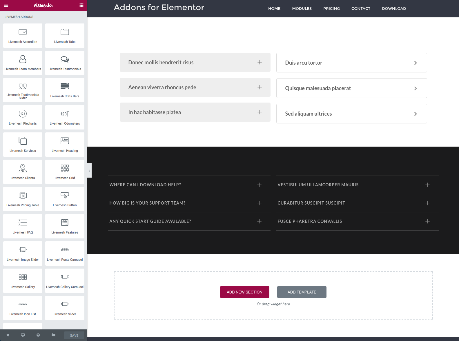
Once you are done with developing the site, for performance gains, you can selectively deactivate the unused elements in 'Elements' tab of Page Builder', 'livemesh-el-addons') ?> page. This will ensure that scripts and files relating to the deactivated elements do not load on your site.
Below is a list of required/recommended plugins to install that will help you get the most out of this plugin. Although some of these plugins are optional, we recommend that you install these popular plugins if you plan to install the demo data and get most out of this plugin. The demo site and the sample data provided with the premium version of the plugin utilizes all of these plugins including the Portfolio Post type plugin.
These plugins are also listed in the Plugins tab of this help file under Elementor Addons → Documentation, and you can install the plugins directly from there.
Elementor is perhaps the most loved page builder tool for WordPress powering over 100,000+ sites. You can build any layout you can imagine with intuitive drag and drop builder with little or no programming knowledge.
All of the elements part of Livemesh Addons for Elementor plugin were built using the API provided by the Elementor plugin and hence this plugin must be installed and activated on the site prior to using our plugin.
All of the pages of our demo site for the plugin have been built using this page builder. You should install and activate this plugin prior to replicating the plugin demo site by importing the sample data provided.
If you have premium version of the plugin installed, you can install the demo data to replicate the plugin demo site to get a head start on building your site. Installing demo data reduces the learning curve associated with trying out the powerful elements part of this plugin.
The sample data imports the pages, posts and portfolio items part of the demo site. Once you are done with playing around the elements and feel comfortable creating/configuring them, you can delete the unwanted pages/posts that you may not need.
Prior to installing demo data, make sure you have recommended plugins installed as mentioned above in the Recommended Plugins section.
The demo site sample-data.xml file is located in the plugin directory created after unzipping the premium bundle. Once you have access to the sample data file, you can install the demo site by visiting and click Choose File. Upload the xml file and follow the steps to import. When the demo data is finished importing, you will have many pages that contain elements configured in them.
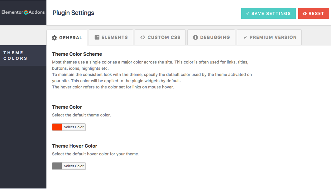
The settings screen for the plugin is self-documenting with minimal options. Make sure you choose the theme color scheme in the 'General' tab to help ensure the plugin takes this as the default color for elements like buttons and links which have default color set.
Clicking on the controls grid button at the top opens the page builder left sidebar with all of the elements grouped into multiple sections within the sidebar window.
Once the elements are added and data required for them is entered, you can save the changes by clicking on the 'Save' button at the bottom right of the Elementor sidebar.
The strength of this plugin over many others is that this plugin lets you customize almost any piece of HTML generated by an addon part of the plugin. You can move around or modify the output elements to suit your needs - change HTML tags, change sequence of information (e.g., place image at the bottom of the post in a grid), add new CSS classes of your own, add branding material, delete unneeded output element (e.g. remove post meta information), modify information (e.g., truncate description or excerpt generated) etc. with the help of templates and filters provided by the plugin.
Following are the two ways to customize the output of an addon part of the plugin.
Filters are hooks that are provided at almost every customization opportunity that presents itself as the addon renders the widgets by parsing the settings input by the user in the Elementor panel. About 200+ filters have been provided to help users customize almost any information output by the addons of this plugin.
To locate the filters, the users are encouraged to have a look at the PHP code located in the render() function of
the respective addon file located in includes/widgets/ folder.
Templates let you modify the HTML generated by an addon by placing an appropriately named PHP file in a folder named 'elementor-addons' in your child theme (or parent theme).
Following are the names of the files that plugin looks for to customize the respective addon
rendering - clients.php, carousel.php, heading.php, odometers.php, piecharts.php, posts-grid.php,
posts-carousel.php, pricing-table.php, services.php, stats-bars.php, team-members.php, testimonials.php,
testimonials-slider.php, accordion.php, button.php, faq.php, features.php, gallery.php, gallery-carousel.php,
icon-list.php, image-slider.php, posts-block.php, services-carousel.php, slider.php, tabs.php.
Once a particular template file is found in the theme folder, the corresponding addon rendering code is
replaced with that in the template PHP file. The template files are provided with $settings variable to
help read the addon settings and then display the output. The current output generated by the plugin addon can
be seen in the render() function of the addons PHP file located in includes/widgets/ folder. In
most cases, it is recommended to copy over the rendering code from the render() function to the template
file and modify the same to achieve the desired customization. A basic knowledge of PHP and HTML is all that is
required to customize an addon.
The below sections provide help on each of the elements/addons built as part of Livemesh Addons for Elementor plugin.
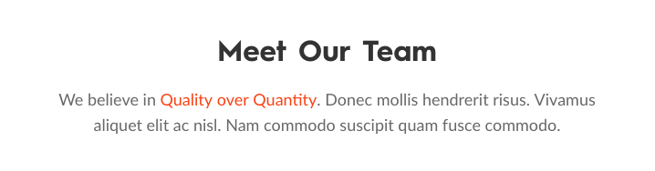
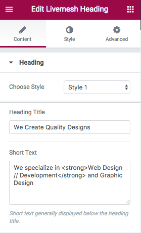
The heading element is perhaps the most frequently used element on a page since it displays a heading at the top of a section.
It comes in three styles – Style 1, Style 2 and Style 3 which allow variations of headings displayed in various sections.
The heading consists of the main heading text which is renders as one of the HTML heading tags on the frontend. Additionally, a short text is displayed below the heading and some of the heading styles allow you to input a subtitle which is usually displayed on top of the main heading title.
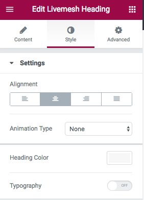
You can choose to align the heading left, right or center with center being the default alignment.
The premium version of the plugin allows selection of a custom font for the heading title. You may choose one of 500+ custom fonts hosted in the Google Fonts library. By default, the heading font used by the theme is used for main heading title.
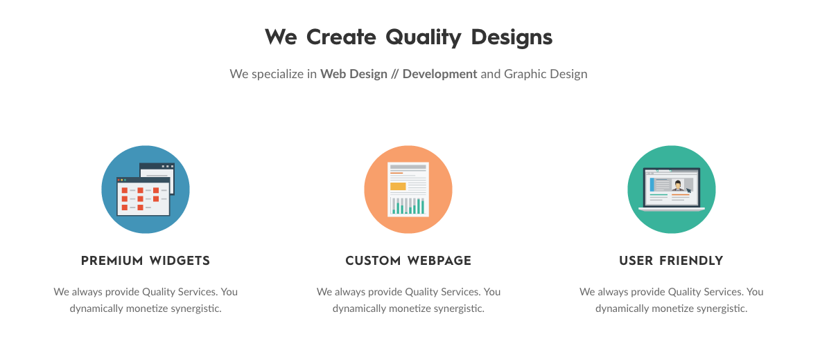
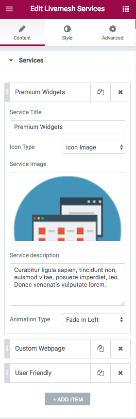
Many agencies, freelancers, corporates, products/apps require capturing the services provided by the agency or the features of a product. The services element is designed to help users capture these services or features in a multi-column grid.
The element supports about 3 different styles (with 2 additional styles in premium version of the plugin) and each of these styles can be customized further by choosing the type of icon desired to represent the service – a font icon or an custom image icon. While the choice of font icons is huge in number and perhaps sufficient for most common services, the icon images can help present the unique nature of the services offered.
Each of the service requires you to input a title for the service/feature and a short description of the service offered or the product feature. Additionally, each service allows you to enter a font icon or an icon image file to represent that service.
The premium version of the plugin allows you specify a custom font size, font color and and hover color for the font icon along with providing two additional styles of services/features.
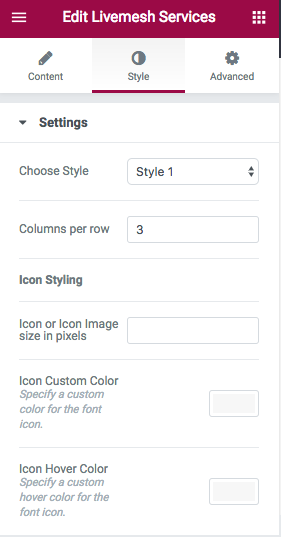
Services element supports the following options –
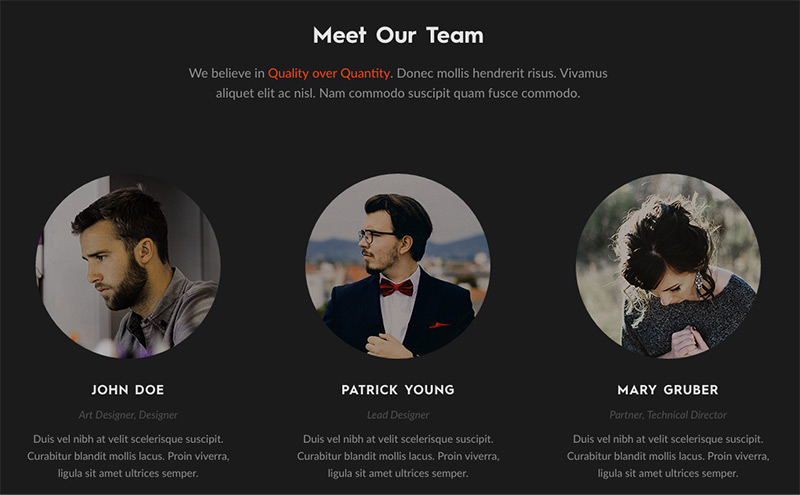
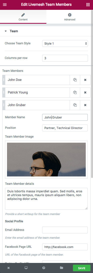
This element provides an easy way to capture the team members of your organization or an agency. The details captured include team member name, position, a short description and the email plus social profile of the individual team members.
Two different styles are provided with more styles planned in the premium version of the plugin. Most of the styles display the team members in a multi-column grid. The option to specify the number of columns is provided that helps to control the number of team members displayed per row of the team members.
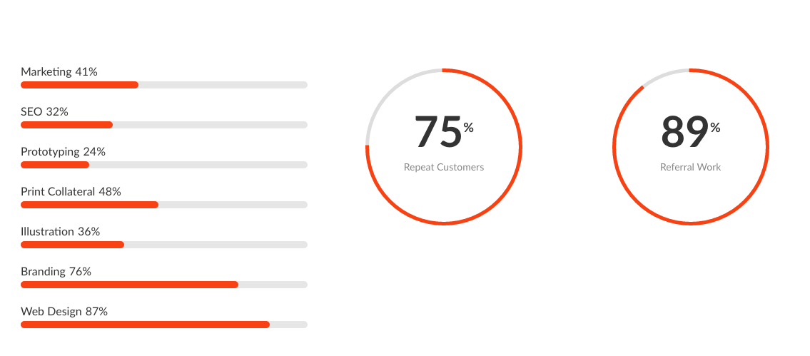
The plugin features a number of elements that help display statistical information in the form of odometers, piecharts and stats bars.
Most of these addons are designed to animate the display of the statistical information or numbers when the users scroll down to the section containing the widget.
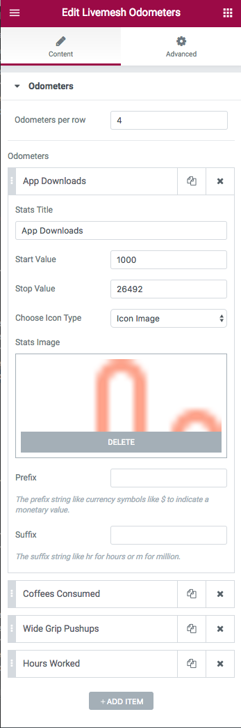
Odometers
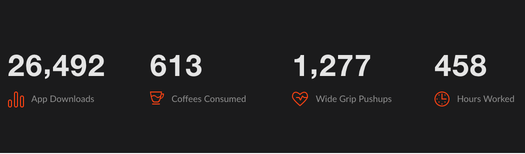
This element displays one or more animated odometer statistics in a multi-column grid. This number statistic requires a start and an end value with a title and icon providing the information about what the number represents – like a download number or number of products sold or customers gained.
The element animates from the start value to the end value when the user scrolls down to the section. You can control the number of such odometers displayed per row.
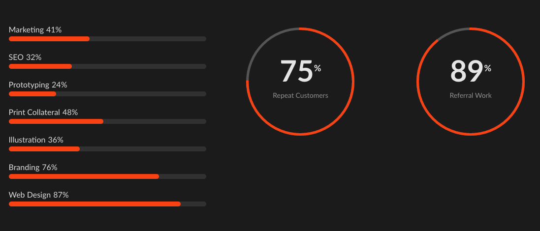
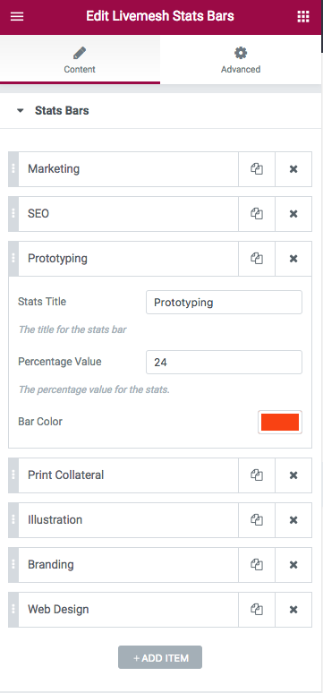
Stats Bars
Stats Bars capture percentage statistics like coverage area, skills gained, survey findings, usage statistics etc. that typically require bar charts to represent them. Each statistical item requires a percentage value, a title describing the number. The user can choose to display the bar charts in multiple or single color with the help of color choice available with each value input.
The element animates from the zero to the percentage value set for the item when the user scrolls down to the section containing the widget. The bars are placed one below the other horizontally.
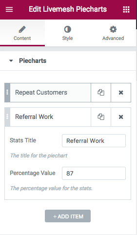
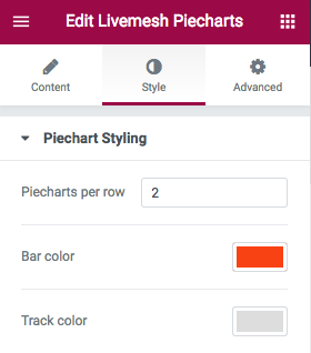
Piecharts
Piecharts provide an alternative way to display percentage stats. When the users scrolls down and the chart becomes visible, the element animates from zero to percentage value provided for the statistic. A bar of user chosen color moves along a track to display the percentage information. An option to specify the number of charts displayed per row is provided.
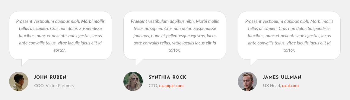
The plugin features two addon elements for capturing testimonials received for your product or business or services. Most agencies, corporates, small businesses, freelancers and products/apps require testimonials to displayed prominently on the site to help convert visitors to customers. The two elements provided are elegantly designed to achieve greater conversion rate.
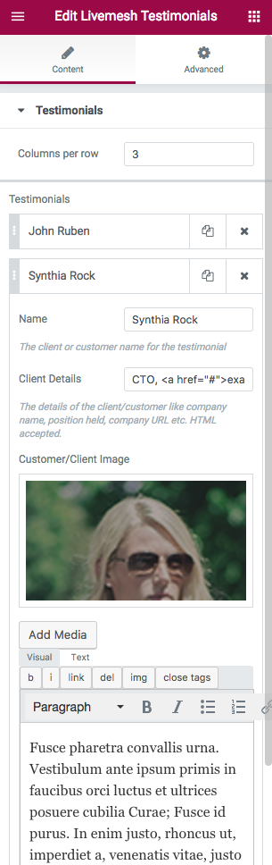
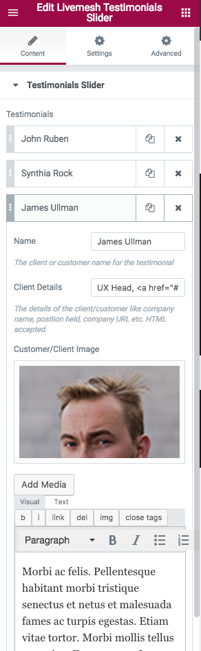
The testimonials information include details about the person/company endorsing the product/service; details like name, company, website of this person/organization along with an image representing this person/entity.
Testimonials
The regular testimonials widget displays multiple testimonials in a row with the user having the option to specify the number of items per row. This is useful if you need a large number of testimonials to be visible instantly when the user scrolls down to view the testimonials section.
Testimonials Slider
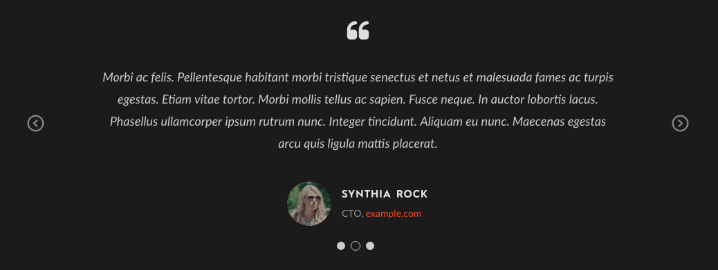
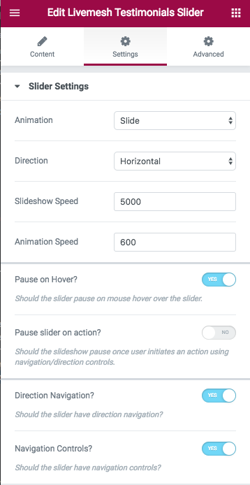
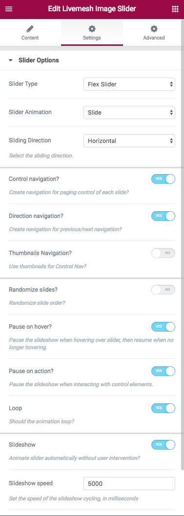
The testimonials slider widget is useful for display of endorsements/recommendations with large amount of text for each testimonial. The slider displays the testimonials as a slideshow with multiple element options provided to control/customize this slideshow – options like speed of switching, speed of animation, whether to pause the slideshow on hover, controls needed for manual navigation by the user etc. The slider is completely responsive and touch swipe controls available for easy navigation on smartphones/tablets.
The testimonials slider provides quite a few options to customize the behavior of the slider. Options include slideshow speed, animation speed, slider navigation contols etc.
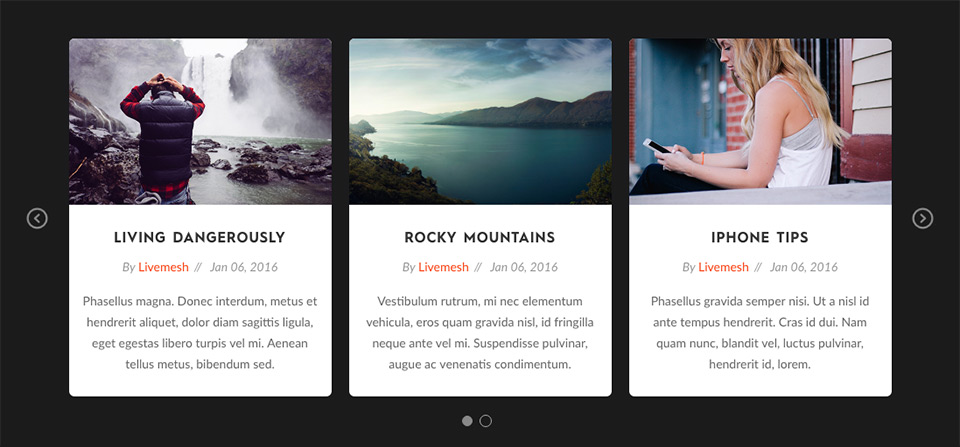
The responsive carousel helps display posts or any custom post types like your portfolio entries with controls available for easy navigation of the items displayed. The element features a Posts Query window to help choose posts or custom posts to display. This powerful tool has number of fields to control what gets displayed and in what order with an additional field available to provide query arguments explained in the codex page.

The Posts Query tab has the following options for filtering posts –

The posts carousel has numerous other options to control the display of posts or custom post types. Some of these are –


Carousel Settings – This section has options that control how the carousel is displayed. Options include autoplay speed, gutter value between post items in various resolutions, navigation controls for carousel, number of columns or items to display before making the user to scroll for additional items etc.
Livemesh Carousel is a generic carousel of custom HTML content of your choice. Possibilities are endless – image carousels with textual content describing the images, video carousels, event carousels with link to the events, a carousel of team of volunteers, a collection of books sold on Amazon etc.
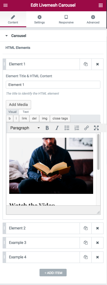
If you need a carousel of custom content HTML of your choice, this element helps achieve the same. For the HTML content, you will need to provide your own custom CSS under Settings for the carousel. While posts carousel helps you display carousel items derived from posts or custom post types, this element lets you display any well-formed HTML content as items in a carousel. You may use the WordPress visual editor to construct the required content.
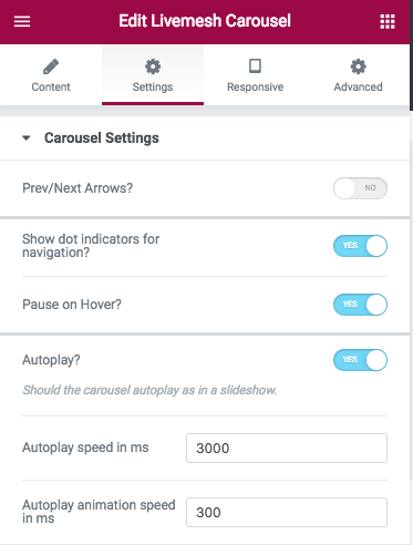
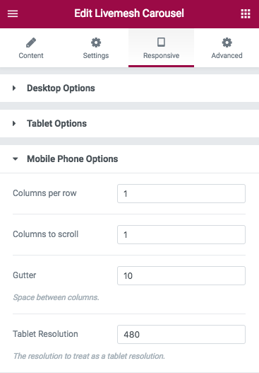
The section ‘Carousel Settings’ has options that control how the carousel is displayed. Options include autoplay speed, gutter value between post items in various resolutions, navigation controls for carousel, number of columns or items to display before making the user to scroll for additional items etc. The carousel settings are explained in the help section above for Posts Carousel.
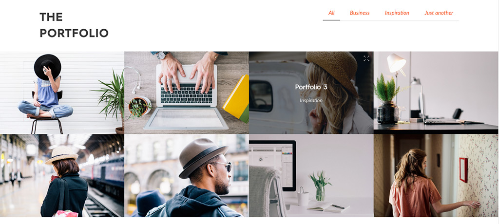
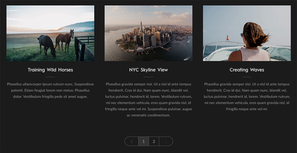
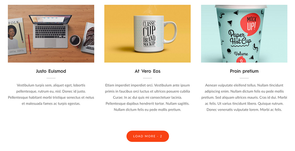
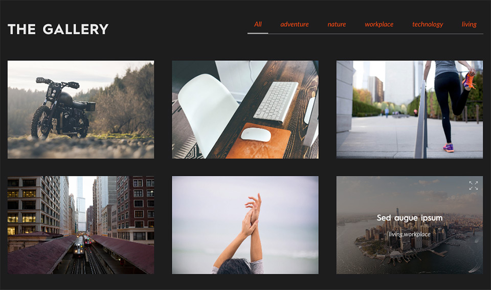
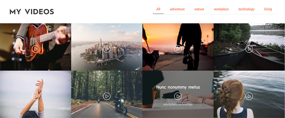
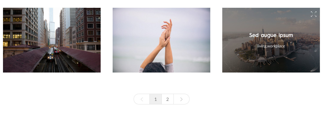
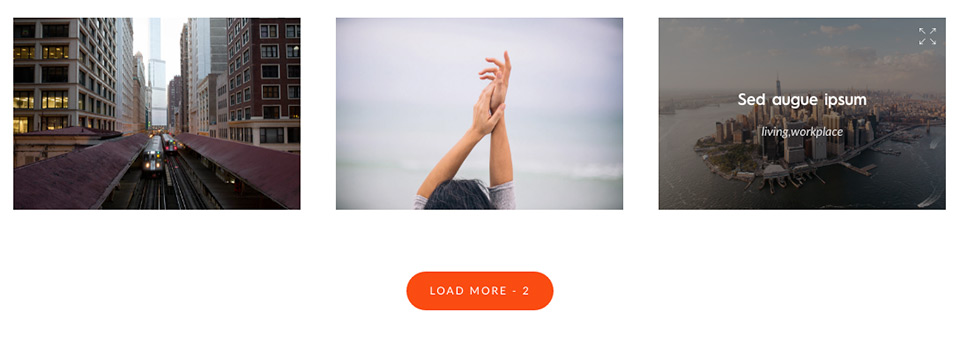
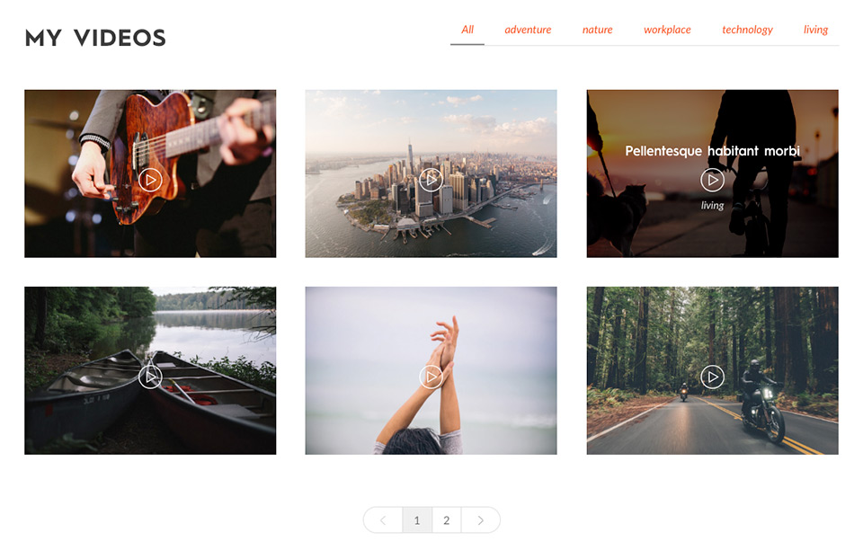
Perhaps the most popular and most important of all addons part of this plugin, Posts Grid helps you build a multi-column grid of posts or custom post types. The posts displayed are filterable by taxonomy terms.
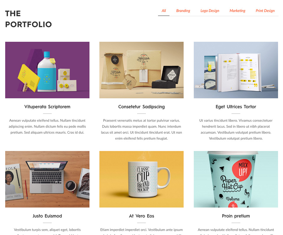
Using the Grid widget, you can construct a portfolio of your work/services/products. We recommend you use the popular plugin – https://wordpress.org/plugins/portfolio-post-type/ for building a collection of portfolio entries. Once the portfolio entries are in place, make sure you select Portfolio Post type under Post Type entry in Build Tools window as explained below.
The premium version of the plugin has support for pagination, lazy load with load more button and lightbox option for images. The additional posts are loaded via AJAX when the user navigates through the pages populated or when the user hits the Load More button.
The element features a Posts Query window to help choose posts or custom posts to display. This powerful tool has number of fields to control what gets displayed and in what order with an additional field available to provide query arguments explained in the codex page.

The Posts Query tab has the following options for filtering posts –


The grid element has numerous other options to control the display of posts or custom post types. Some of these are –
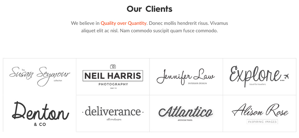
Whether you are freelancer or run a small business, agency or represent a big corporate house, you have a list of clients that you have worked with. This element lets you create a list of these clients with banner images representing these clients.
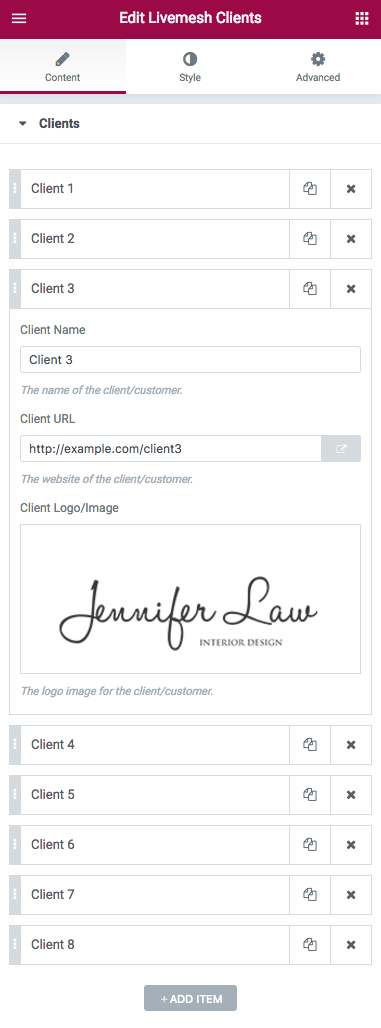
For each of the client, you provide a client name, a banner image for the client and a URL for their website. The client name is shown on user hovering over the banner image and title text is optionally a link pointing to the website of the client, if that link is provided by the user.
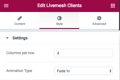
The collection of clients will be displayed in a multi-column grid. The ‘Columns per Row’ option lets you control the number of client entries per row of clients displayed.
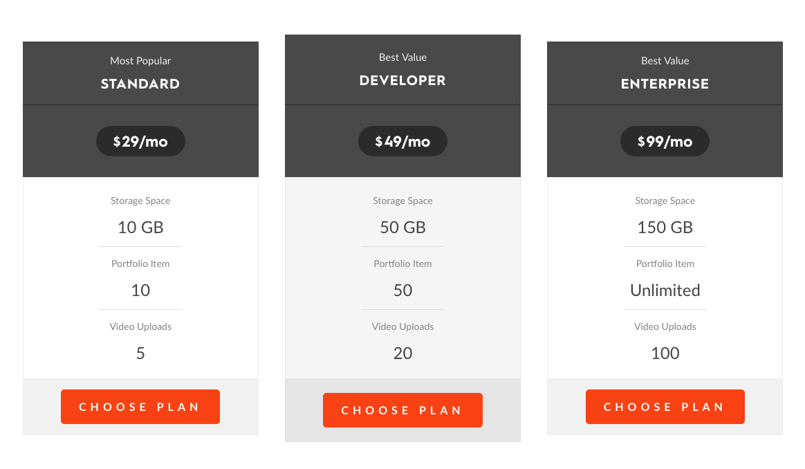
The pricing plans offered by your business can be captured with pricing plan widget. The pricing plans are displayed in a multi-column grid.
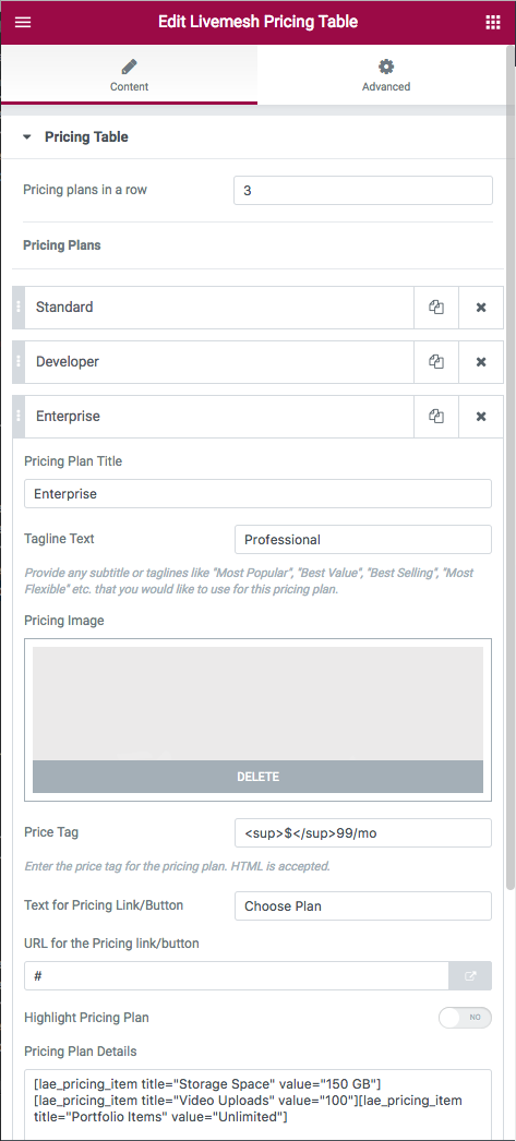
For each of the pricing plan, provide the following information –
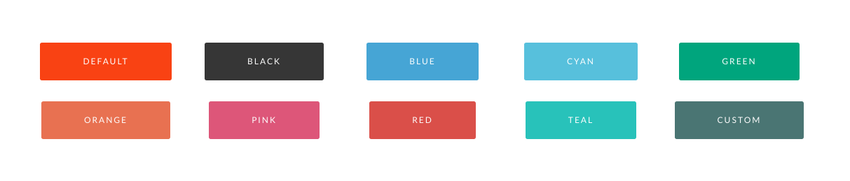
The plugin lets you create buttons of multiple colors that you would use in your site. The supported colors are Orange, Blue, Teal, Cyan, Green, Pink, Black, Red, Transparent and Semi Transparent (for dark backgrounds). You can choose a custom color and custom hover color too for the button to create a button of your chosen color.
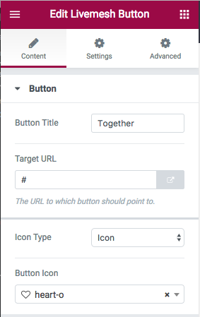
You may choose to create a button of Default color which is the color derived from the Theme Color set in the plugin options.
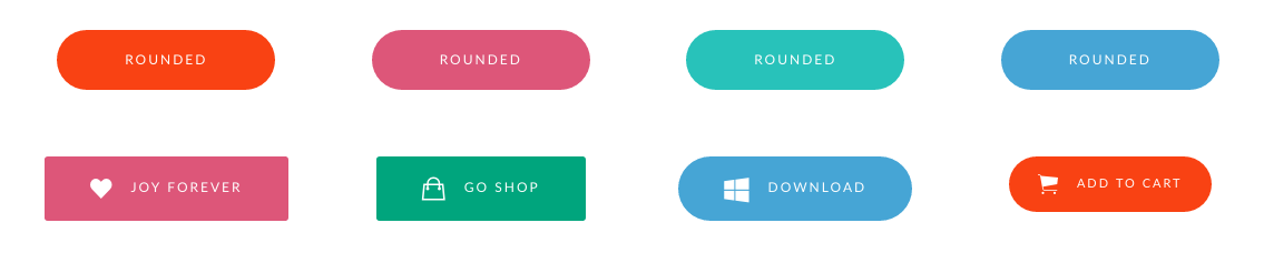
Additional options provided are button size, rounded and alignment – center, right, left and None.
You can choose to display an icon along with the button text. The icon can be a icon font or an image.
The element options are mostly self-explanatory and you can view a live preview of the buttons here.
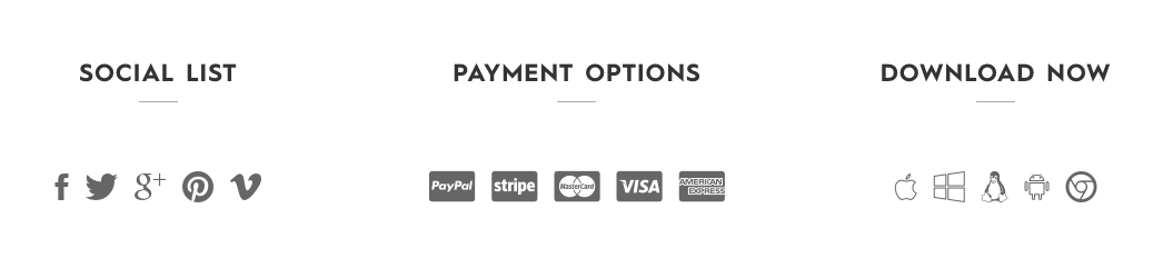
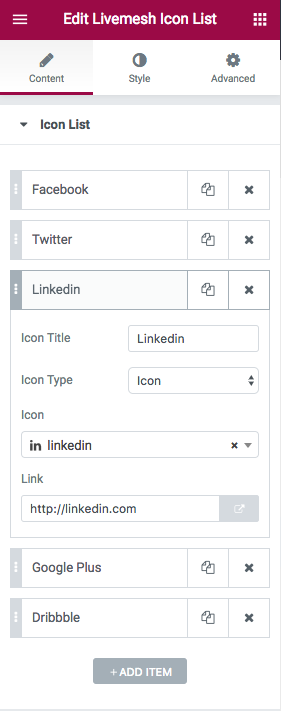
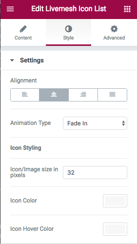
The icon list element is extremely useful for creating a list of icons with optional links to sites or pages that the icons represent. Examples include social media profiles, icon lists representing payment options or download platforms or a quick summary of services.
Each of the icons part of a list have a title, optional target URL and the icon itself can be a font icon or an custom image. The title for the icon is displayed as a tooltip on mouse hover.
Following options are available –
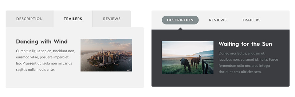
A large of finely designed styles are supported by tabs function of the plugin. Tabs can be of two types – vertical and regular horizontal style tabs.
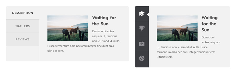
There are a total of 10 tab styles to choose from. There is simply no another plugin or theme that supports so many elegant styles for tabs.
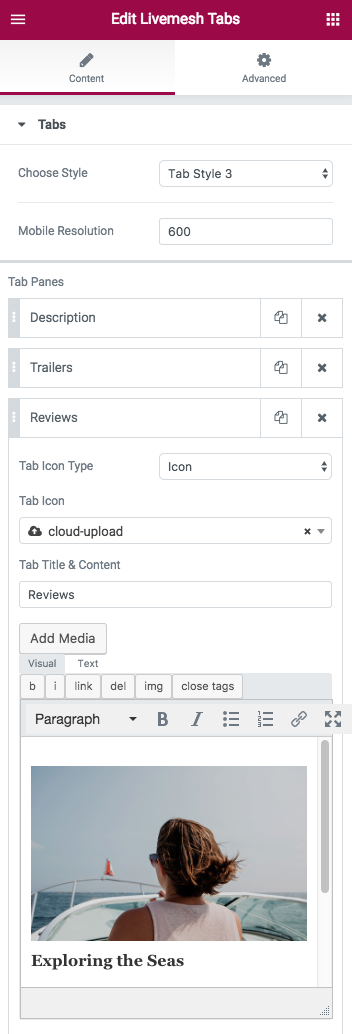
Tabs required two attributes – a tab title and tab content. For styles that support icons, choice of displaying a font icon or an icon image along with the tab title is supported.
Mobile Resolution – Indicate the device resolution in pixels for displaying the tab in responsive mobile mode. The tabs are designed to work well in all device resolutions without sacrificing usability.
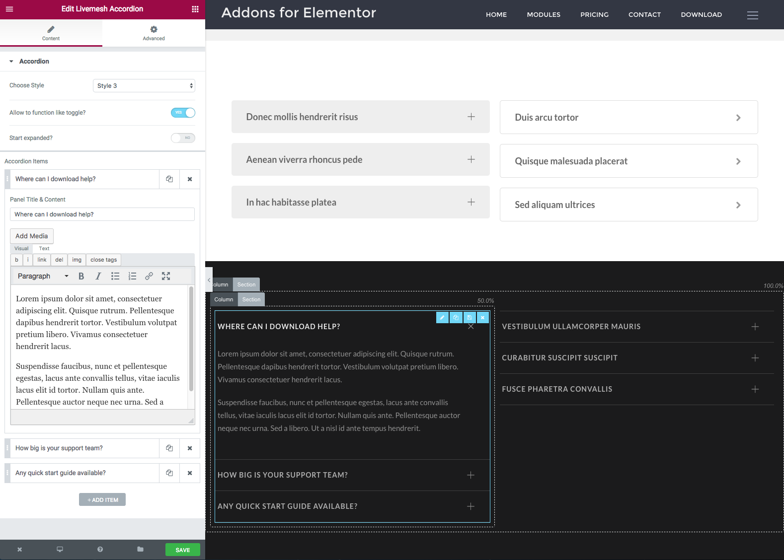
Accordions
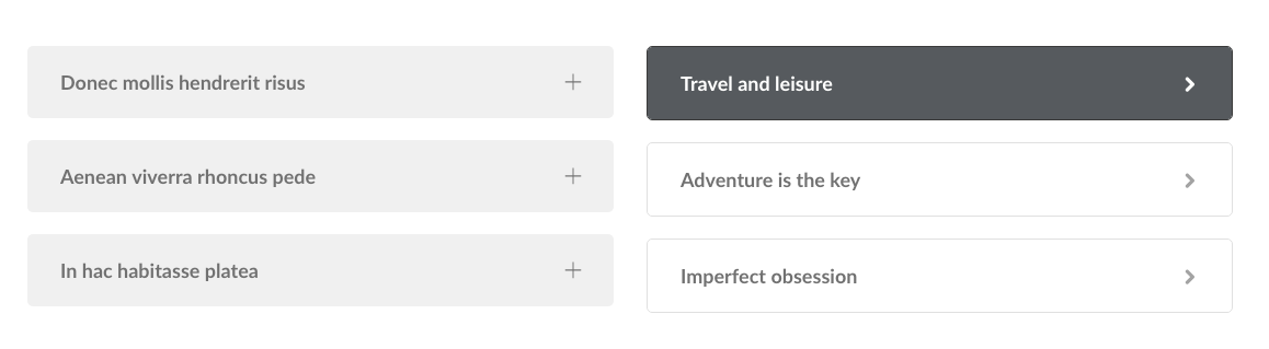
Accordions support panels that are collapsed by default. The panels can be opened by clicking on panel title bar.
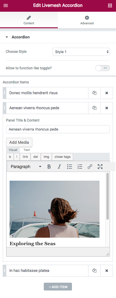
Each of the panels part of an accordion require the user to input a tab title and tab content.
Option to allow multiple panels to be open is provided.
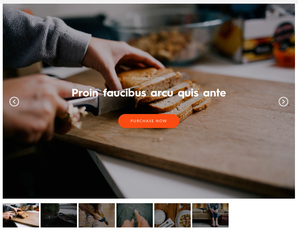
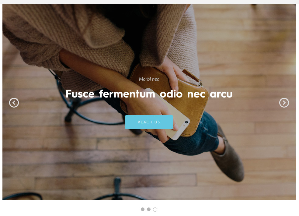
The image slider lets you create a responsive slider of images with a multiple options to customize the function and presentation of the slider. The slider can be used anywhere on a page and can also function as the main slider of the page displayed at the top of the page. The slider supports multitude of options but for most users, the default options provided should suffice.
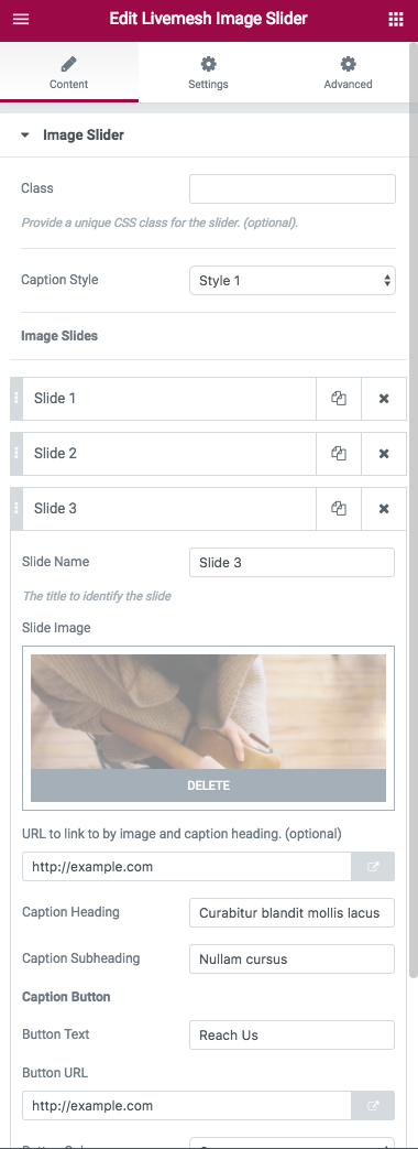
Each slide for the slider allow for following options –
Slider Caption Details
Slider Settings – The element has a number of options available for customizing the slider experience –
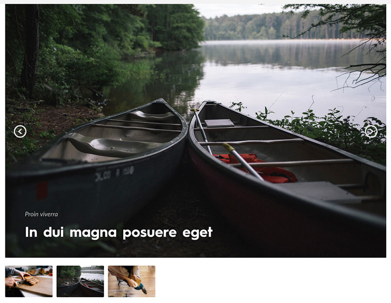
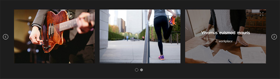
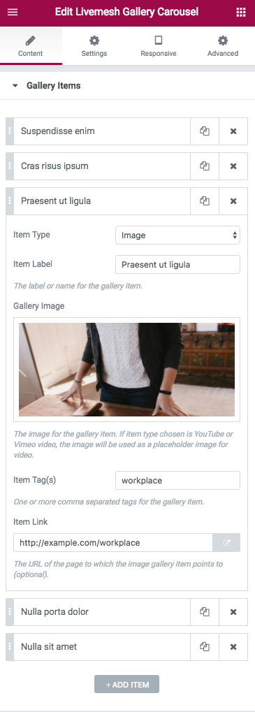
This powerful element lets you create a gallery of images or videos displayed in a multi-column grid. An instance of this element can capture a portfolio of work like that of a photographer or graphic designer/artist. Recent versions of the plugin added a nifty 'Bulk Upload' option to this addon to help choose multiple images and create image galleries instantly.
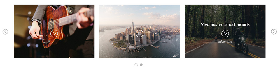
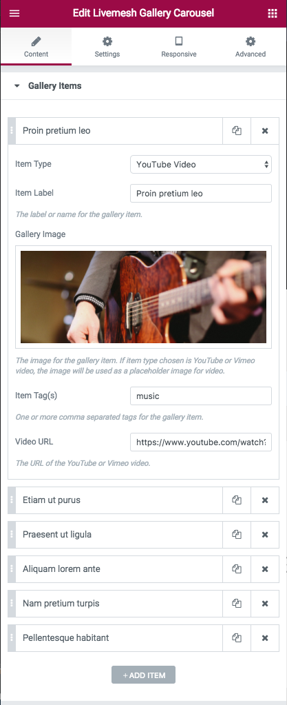
It can be used to create a gallery of videos uploaded to YouTube/Vimeo – useful for video bloggers, video tutorial sites, video marketers, small businesses or websites with a major presence on YouTube/Vimeo. The videos can be played with a single click of the play button on the gallery item as seen in this demo page.

The configuration for creating a video gallery is similar to that of image gallery; a video URL would be required along with image that acts as a placeholder.

Each of the gallery items capture following information –


The Gallery element comes with following settings –
You can create a carousel of images/videos (or a combination of both) for showcasing your work or video content uploaded to Vimeo/YouTube. An instance of this element can capture a portfolio of work like that of a photographer or graphic designer/artist.
It can be used to create a carousel of videos uploaded to YouTube/Vimeo – useful for video bloggers, video tutorial sites, video marketers, small businesses or websites with a major presence on YouTube/Vimeo. The videos can be played with a single click of the play button on the gallery item as seen in this demo page.
The option for creation of video carousel is similar to that of image carousel - requires input of URL for the Vimeo/YouTube video along with placeholder image.
Each of the gallery items in the carousel capture following information –
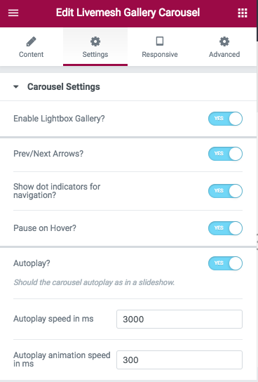
The section ‘Carousel Settings’ has options that control how the carousel is displayed. Options include autoplay speed, gutter value between post items in various resolutions, navigation controls for carousel, number of columns or items to display before making the user to scroll for additional items etc.
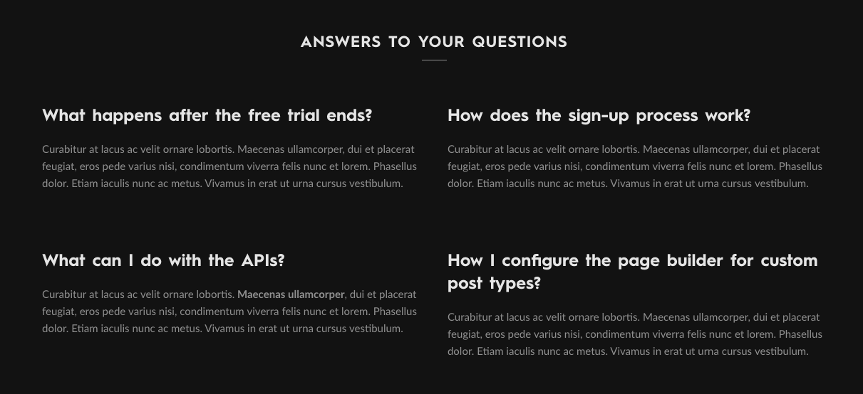
The FAQ makes the task of creating a FAQ for a site effortless. Just enter FAQ items and choose the number of items to show per row of content and you are done.
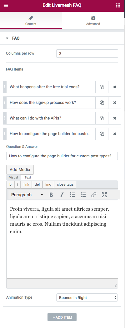
Each FAQ item requires two input – question and an answer for the question part of the FAQ.
Do note that the Accordion function of the plugin too can be used to create a nicely formed FAQ for a site.
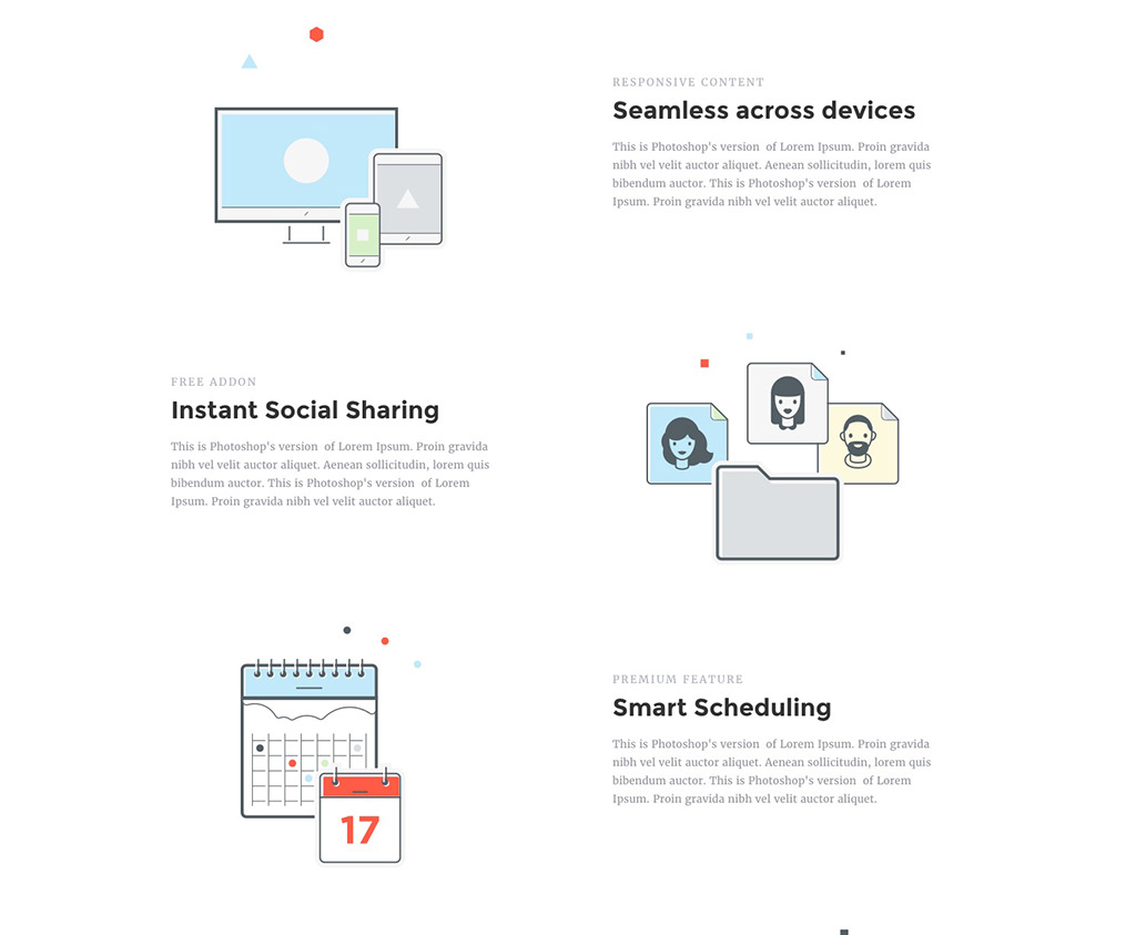
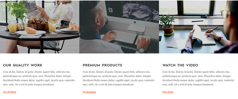
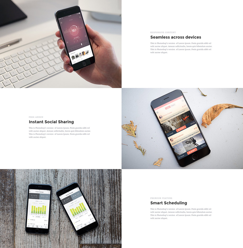
Features element lets you showcase a number of things. Below are some examples although possibilities are many -
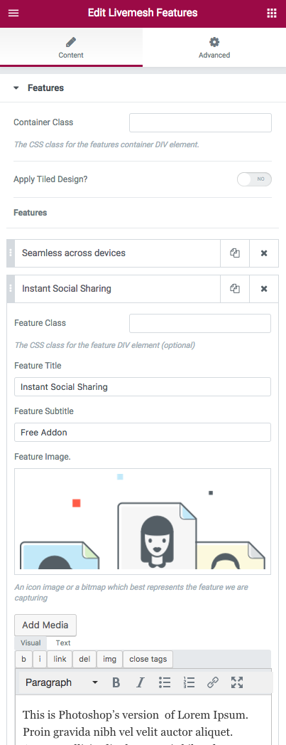
Any feature part of the features element requires you input an icon image or a screeshot which represents the feature you are describing. Aside from the icon or screenshot, you will need to provide details like heading title, subtitle and description of the feature.
The features element has an option to apply popular tile-based design to the features list (screenshot below). The examples of this is seen in the demo site showcasing the features widget.
If you have queries or issues to report related to the plugin, please submit the same through our website contact form. This will create a support ticket in our support portal.
Below is a list of required/recommended plugins to install that will help you get the most out of the plugin. While Elementor plugin is required, the rest of the plugins are optional but we recommend you install these plugins if you plan to replicate the plugin demo site by importing the sample data.
Elementor is one of the most popular frontend page builder tool for WordPress powering over 100,000+ sites. You can build any layout you can imagine with intuitive drag and drop builder with little or no programming knowledge.
All of the elements part of Livemesh Addons for Elementor plugin were built using the API provided by the Elementor plugin and hence this plugin must be installed and activated on the site prior to using our plugin.
All of the pages of our demo site for the plugin have been built using this page builder. You should install and activate this plugin prior to replicating the plugin demo site by importing the sample data provided.
Portfolio Post Type is a free plugin that registers a custom post type for portfolio items. It also registers separate portfolio taxonomies for tags and categories. The Portfolio grid instances showcased on our demo site was built using custom post types registered by Portfolio Post Type plugin.
Our tests indicate that the elements work well with most themes that are well coded. You may need some minor custom CSS with themes that hijack the styling for heading tags by using !important keyword.
The demo site is best recreated with a theme that supports a full width page template without sidebars. The elements can still be used in the pages of default template.
In Elementor page builder, edit the section wrapper for the element representing a row of elements. Navigate to the 'Advanced' tab of the 'Edit Section' sidebar window. Scroll down to the bottom of this tab to the 'Advanced' section and input class ‘lae-dark-bg’ in the 'CSS Classes' field to activate the dark version of an element.
Pls install and activate the Portfolio Post Type plugin to enable custom post type Portfolio.

The premium version of the plugin entitles you to quick support with replies posted within 24 hours (on week days).
Please submit your support query through our website contact form. This will create a support ticket in our support portal.
If you need to leave your feedback or have a query regarding one of our WordPress plugins or themes, feel free to leave us a message through our contact form and we will get back to you promptly.